The power to shine
Everyone should have the power to shine. And I mean this both metaphorically and literally.
Today I had this glamorous feeling floating around me all day, so I felt like diving deep into the Swarovski universe. So I dug and i dug until I stumbled upon this fabulous festival of colors that is their Fall/Winter 2016/17 theme. Yes, I know I am a little late, but in my defense, not one of the more current concepts has satisfied my visual need for color as much as this one. Therefore, I really felt I needed to write about this and only this (for now). What can I do? I’m not the one to choose what tickles my inspiration. The inspiration chooses me. Anyway, this truly is an inspiring theme and I feel like all my artsy senses are all over right now, so I thought why not share it with the world? And also, it IS fall after all, so what better time for a fall/winter collection recycle?
As I have researched, the Fall/Winter 2016/17 Swarovski concept, Power to Shine takes four inspirational design directions: Protectors of Equality (Classic), Saviors of the Planet (Romantic), Explorers of the Future (Progressive) and Guardians of the Past (Glamour). The word resilience is the link between them, being the icon for the need of self-reliance in times of uncertainty, in times when people try to take their future into their own hands and handcraft a better society so that everyone can have the power to shine.
Classic. Protectors of Equality
Red, violet, and peach are some distinctive tones for this color palette which reflect the androgynous contemporary world we live in. Also the classic design gives black and burgundy hues merging with amethyst to create depth and drama.
(Protectors of Equity crystals, fusionbeadsblog.com)
Romantic. Saviors of the Planet
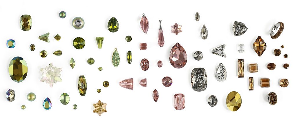
Camouflage colors with hues of green and blush rose come together to create beautiful earthly colors and natural tones. This color palette represents Mother Earth herself and draws attention to the natural beauty.
(Saviors of the Planet crystals, fusionbeadsblog.com)
Progressive. Explorers of the Future
Bright yellows and blue-ish greens fusing with shades of silver and gray are specific for this design direction creating a futuristic palette with science-fiction and robot-like, even outer space elements.
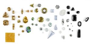
(Explorers of the Future crystals, fusionbeadsblog.com)
Glamour. Guardians of the Past
Shades of red, from ultra-bright to deep-dark are teamed with chrome, gold and a touch of blue here and there to give birth to a royal and aristocratic palette, all this still keeping an edgy modern appeal.
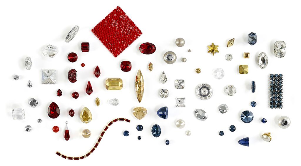
(Guardians of the Past crystals, fusionbeadsblog.com)
All in all, not only am I in love with the crystals, but I just couldn’t help but notice how intriguing is the way they link their palettes and designs with the world of today, transforming their products in instruments for “fighting” the struggle of contemporary life.
And if the pictures didn’t convince you, just have a look at this:
Credit foto: fusionbeadsblog.com


You May Also Like