
Studying design has truly opened up my eyes about how literally everything around us is created with the purpose of evoking certain emotions, whether they are obvious or not. Fonts play a big role in this – they have the power of setting a certain mood and subtly take your mind to specific places depending on the purpose and the subject of the text provided.
1. Serifs: Trustworthy Fonts
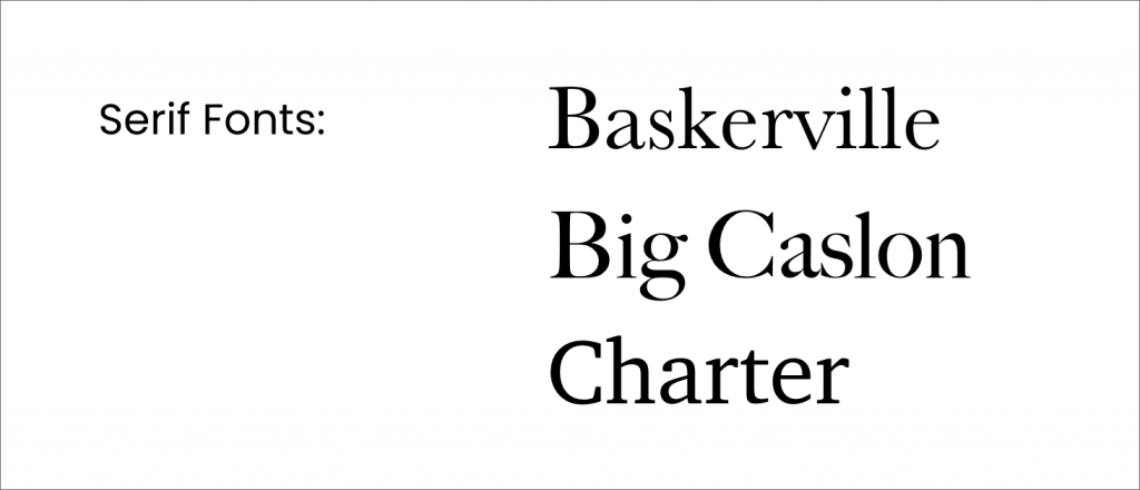
Until the 19th century, books and pamphlets were set in serif type—a style inherited from early Roman and, later, Blackletter typefaces. The first sans serif typeface appeared in print in 1816, but serifs still remained widely popular throughout the late 19th century and into the early 20th century.
Because of this heritage, serifs instantly evoke a sense of establishment and tradition, an association that is carried through into the branding of many banks, law firms, and newspapers. It’s a favourite font style in publishing, with most books still set in serif type, helping to communicate a mood of intellect and authority to readers.
The psychology of fonts in a serif style stems from their history. Because we are used to seeing serif fonts as symbols of heritage (on historical artefacts and prints), intellect (in books and academic papers), and formality (on fancy invitations and high-end restaurant menus), we perceive serif fonts as trustworthy and dependable. In other words, we know where they’ve been and that they are often the defining, powerful font style of long-established and respected institutions, such as universities and banks.
2. Slab Serifs: Powerful Fonts
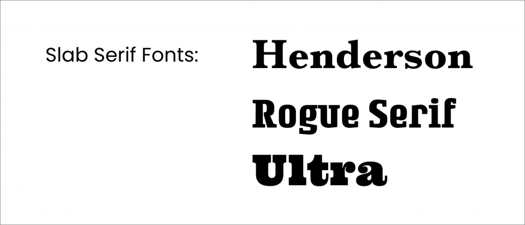
Slab serif fonts are chunkier, bolder interpretations of the serif type style. Usually thicker along both the stem and serifs of letterforms, they inherit some of the traits of serif fonts, such as stability and tradition, but are also bolder and more distinctive.
Slab serif fonts lack the delicacy of serif fonts, making them feel a little brash and macho. Electronics companies and car manufacturers often use slab serifs to communicate a sense of power and masculinity in their branding.
In the wrong context, a slab serif could feel confrontational, but when used in the branding of companies that have a manufacturing focus, they feel strong, capable, and enduring. A slab serif is an assertive and powerful font, telling viewers that this is a practical, hands-on business that also has historical, dependable roots.
3. Sans Serifs: Friendly Fonts
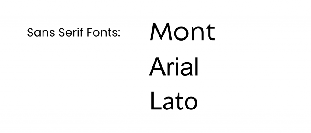
Referring to a wide group of fonts which lack serifs (the small strokes attached to the ends of letterforms on serif fonts), sans serif typefaces were formally invented in the early 19th century but only became popular much later, during the 20th century, when the modernist movement championed a break away from traditional design forms, including serif type styles.
Sans serif fonts are progressive and emotional fonts, historically popular as advertising fonts and cool fonts for posters. Sans serifs culturally represent a break with tradition, giving these emotional fonts a progressive personality.
In recent decades, these simple and different fonts have defined the branding of a wide number of tech companies and social media sites, helping users to feel that these products are forward-thinking—the opposite of the sometimes stuffy, change-resistant reputation of serif styles.
4. Scripts: Fun Fonts
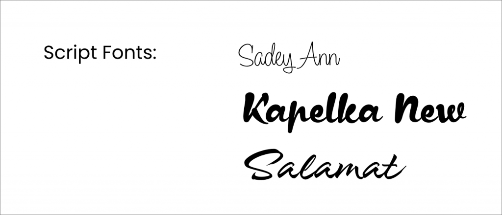
Script and handwritten fonts can lean towards formality or naivety, depending on the style and context. Calligraphy fonts, inspired by the traditional method of handwriting using ink pens, feel more formal and sophisticated, and are often adopted by luxury brands or high-end restaurants in their branding and menus. Many contemporary script fonts are more informal and eclectic, mimicking the diversity of modern handwriting styles.
These eclectic and different fonts are evocative of handwriting and doodling, connecting them with creativity and eccentricity. Given their unique and quirky form, these emotional fonts are rarely sombre. Script fonts also remind the viewer of youth and first romances, making them a popular choice for Valentine’s cards and wedding invitations.
5. Display: Independent Fonts
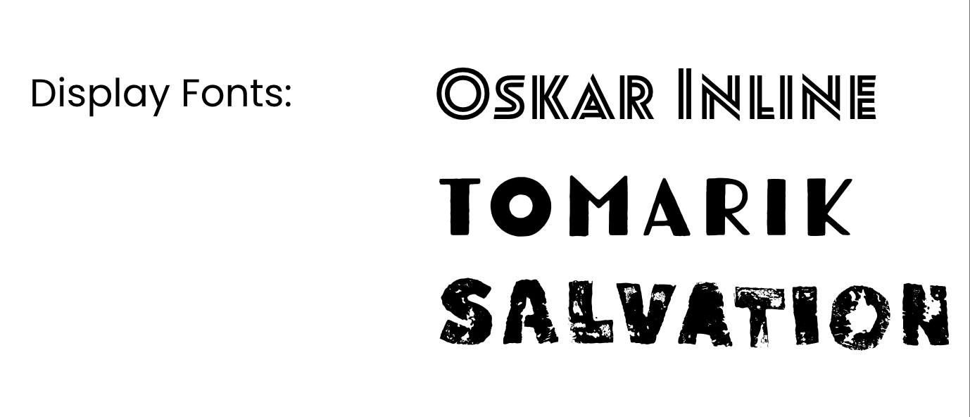
If you encounter a different font you can’t quite place in a neat category, it’s likely it would be classified as a display or novelty font. Some of these types of powerful fonts create a sort of pictographic representation, blending a graphic image with text (see the Tour de France and NASA logo designs), while others are simply heavily stylised. Display fonts are largely meant for that purpose alone, meaning they can work wonderfully as part of headlines or logo designs but rarely as standard text intended for longer reading.
Designers and brands usually opt for a display font to give an impression of individuality and difference, with the practice of the psychology of fonts for logos often featuring display styles. Many of the logo examples below use completely customised fonts or illustrative type, using the psychology of fonts in logos to create a unique effect that is unlikely to be seen anywhere else. For playful brands like Lego and Oreo, logos set in display fonts heighten the novelty of the product, making it feel more exciting and interesting.
To sum things up…
Knowing a little about the psychological effects that different font styles can have on the viewer can help you to make more informed design decisions, especially when it comes to creating brand identities and logo designs. An understanding of these effects will allow you to apply the principles of the psychology of fonts to marketing and the psychology of fonts in logos.