
There are plenty of similarities when it comes to grid and flexbox, which is why it tends to get confusing when you are faced with the situation of choosing between the two. That being said, they also offer specific functionality for specific situations. I’ll go ahead and speed through the main characteristics for each of the techniques, their differences but also their similarities.

CSS Grid
CSS Grid Layout, is a two-dimensional grid-based layout system with rows and columns, making it easier to design web pages without having to use floats and positioning. Like tables, grid layout allow us to align elements into columns and rows.
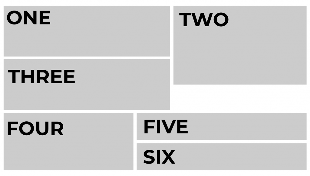
As an example, the image below displays how a website can be divided up into six grid areas. Each section can vary by width, height, position, and they can even overlap.
Some basic properties that I use with CSS grid are: display, grid-template-columns, grid-template-rows, grid-column, grid-row, and gap.
CSS Flexbox
The CSS Flexbox offers a one-dimensional layout. It is helpful in allocating and aligning the space among items in a container (made of grids). It works with all kinds of display devices and screen sizes.
The main properties that I typically use with Flexbox are display, flex-direction, align-items, and justify-content. I suggest checking out the MDN Web Docs for more information on all of the other properties that Flexbox supports.
What makes each of them unique?
One Vs Two Dimension:
- Grid is made for two-dimensional layout while Flexbox is for one. This means Flexbox can work on either row or columns at a time, but Grids can work on both.
- Flexbox, gives you more flexibility while working on either element (row or column). HTML markup and CSS will be easy to manage in this type of scenario.
- GRID gives you more flexibility to move around the blocks irrespective of your HTML markup.
Content-First vs Layout-First:
- Major Uniqueness between Flexbox and Grids is that the former works on content while the latter is based on the layout.
- The Flexbox layout is best suited to application components and small-scale layouts, while the Grid layout is designed for larger-scale layouts that are not linear in design.
What are the main differences between the two?
1. Dimensionality and Flexibility:
- Flexbox offers greater control over alignment and space distribution between items. Being one-dimensional, Flexbox only deals with either columns or rows.
- Grid has two-dimension layout capabilities which allow flexible widths as a unit of length. This compensates for the limitations in Flex.
2. Alignment:
- Flex Direction allows developers to align elements vertically or horizontally, which is used when developers create and reverse rows or columns.
- CSS Grid deploys fractional measure units for grid fluidity and auto-keyword functionality to automatically adjust columns or rows.
3. Item Management
- Flex Container is the parent element while Flex Item represents the children. The Flex Container can ensure balanced representation by adjusting item dimensions. This allows developers to design for fluctuating screen sizes.
- Grid supports both implicit and explicit content placement. Its inbuilt automation allows it to automatically extend line items and copy values into the new creation from the preceding item.
To sum things up…
Each CSS layout has its own unique properties and uses. Flexbox is one-dimensional and should only be used when you are trying to create content on either the x (horizontal) or y (vertical) axis. CSS Grid is two-dimensional and should be used for more complex layouts.
As always, I suggest checking out the documentation. MDN Web Docs is a great resource for not only CSS but also for HTML, JavaScript, APIs, and much more. W3Schools is also a great resource for all things web-development-related. Most of all, I suggest playing around with the two different CSS layouts. Create something simple similar to the examples I gave above. Change the properties and see what happens.